

Credits
Thanks to our incredible collaborators for their invaluable contribution towards making this work possible.
2023
Refinement
Extension
Born out of her need for a modern tool to understand her fertility, Eirini Rapti founded inne in 2017 and together with a team of scientists, developed the world's first at-home fertility monitoring system that measures progesterone levels in saliva.
Female health is under represented and under researched, so inne is using the power of hormonal science to lead a new era of enriched understanding.
This impressive ambition, as well as the quality of their unique product were not matched by their visual brand, which had issues setting itself apart from industry competitors and preparing the company for scale.
The brand was missing a coherent, ownable design language that expresses the supportive warmth, innovative simplicity and confidence of knowledge that inne provides.
We strategically evolved inne from being a product-led brand, to one led by purpose and their position as a guide for woman across life stages.
To reflect this shift, we crafted a visual identity system based on the brand idea “connect with your inner rhythm” that balances scientific accuracy, bold simplicity and human warmth.
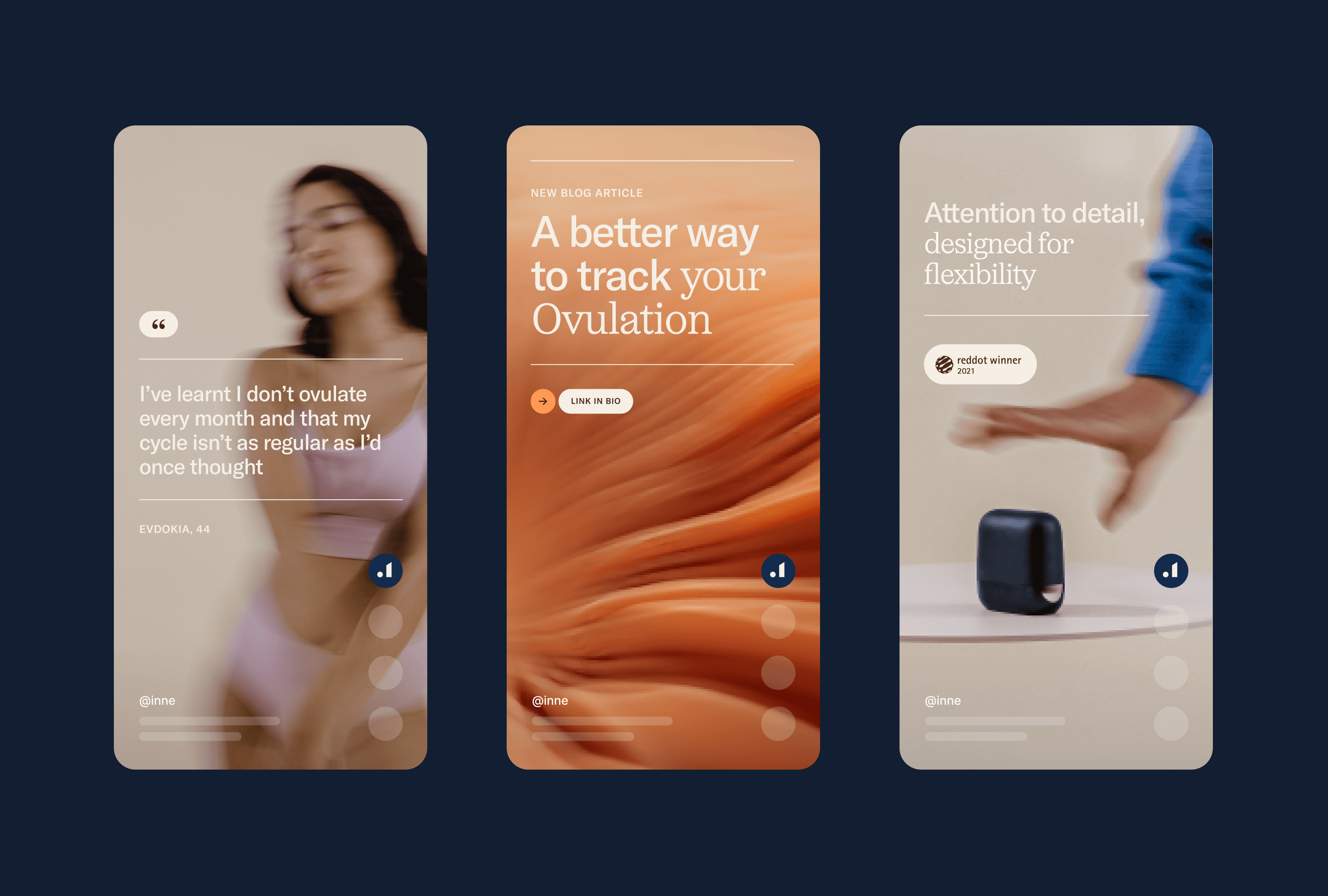
Inspired by science and human biology, we developed a set of soft moving hormonal landscapes that express the unique, always changing inner rhythms of a woman's body.
Complementing these 3D expressions, we directed a photoshoot that captures the simplicity of the product as well as the full spectrum of a woman’s life - the joyful, powerful, vulnerable and the simple moments in between.
A refined colour and typography system, alongside a set of framing and graphic devices brings all the elements together, confidently expressing inne’s purpose, values & path ahead.
2023
Refinement
Extension
Born out of her need for a modern tool to understand her fertility, Eirini Rapti founded inne in 2017 and together with a team of scientists, developed the world's first at-home fertility monitoring system that measures progesterone levels in saliva.
Female health is under represented and under researched, so inne is using the power of hormonal science to lead a new era of enriched understanding.
This impressive ambition, as well as the quality of their unique product were not matched by their visual brand, which had issues setting itself apart from industry competitors and preparing the company for scale.
The brand was missing a coherent, ownable design language that expresses the supportive warmth, innovative simplicity and confidence of knowledge that inne provides.
We strategically evolved inne from being a product-led brand, to one led by purpose and their position as a guide for woman across life stages.
To reflect this shift, we crafted a visual identity system based on the brand idea “connect with your inner rhythm” that balances scientific accuracy, bold simplicity and human warmth.
Inspired by science and human biology, we developed a set of soft moving hormonal landscapes that express the unique, always changing inner rhythms of a woman's body.
Complementing these 3D expressions, we directed a photoshoot that captures the simplicity of the product as well as the full spectrum of a woman’s life - the joyful, powerful, vulnerable and the simple moments in between.
A refined colour and typography system, alongside a set of framing and graphic devices brings all the elements together, confidently expressing inne’s purpose, values & path ahead.
2023
Refinement
Extension
Born out of her need for a modern tool to understand her fertility, Eirini Rapti founded inne in 2017 and together with a team of scientists, developed the world's first at-home fertility monitoring system that measures progesterone levels in saliva.
Female health is under represented and under researched, so inne is using the power of hormonal science to lead a new era of enriched understanding.
This impressive ambition, as well as the quality of their unique product were not matched by their visual brand, which had issues setting itself apart from industry competitors and preparing the company for scale.
The brand was missing a coherent, ownable design language that expresses the supportive warmth, innovative simplicity and confidence of knowledge that inne provides.
We strategically evolved inne from being a product-led brand, to one led by purpose and their position as a guide for woman across life stages.
To reflect this shift, we crafted a visual identity system based on the brand idea “connect with your inner rhythm” that balances scientific accuracy, bold simplicity and human warmth.
Inspired by science and human biology, we developed a set of soft moving hormonal landscapes that express the unique, always changing inner rhythms of a woman's body.
Complementing these 3D expressions, we directed a photoshoot that captures the simplicity of the product as well as the full spectrum of a woman’s life - the joyful, powerful, vulnerable and the simple moments in between.
A refined colour and typography system, alongside a set of framing and graphic devices brings all the elements together, confidently expressing inne’s purpose, values & path ahead.
Thanks to our incredible collaborators for their invaluable contribution towards making this work possible.
Thanks to our incredible collaborators for their invaluable contribution towards making this work possible.
Thanks to our incredible collaborators for their invaluable contribution towards making this work possible.